
I was a kid fascinated by technology and computers in the 1980s. Part of me loves that era where computers held promise that was understood by few. I envied the hackers depicted in films, shrouded in darkness, oily faces illuminated with the flickering green glow of a primitive CRT monitor. The sound of modems screeching into telephone lines, as letters slowly stream down the screen from a faraway server they had no right to be in.
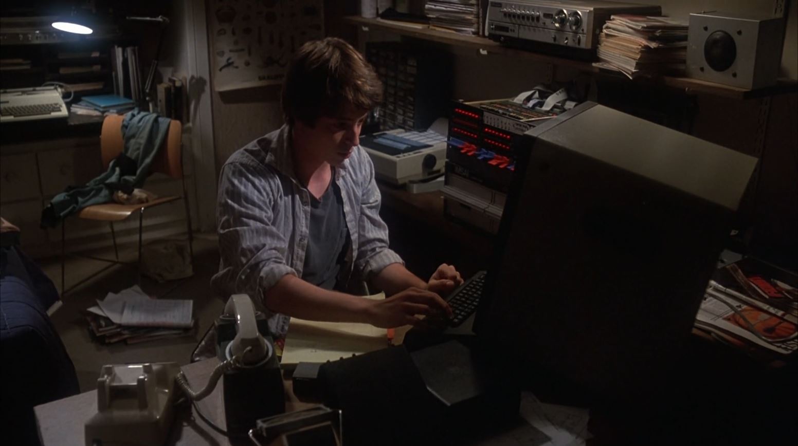 David Lightman dialing a remote server in the 1983 film "WarGames"
ASCII Art
One day I stumbled upon a neat ASCII text generator, and thought it would be fun to make something with it. I love ASCII art from the days before photographs could be displayed on most computers. Some people put so much effort into creating fancy letters and images using only simple letters and characters. I also wanted to couple this with an '80s retro aesthetic.
To get started, we could simply copy the text and put it into a <pre> tag to preserve the line breaks, but we want to give it a "glowing" look, like the phosphors on an old, low resolution CRT.
Glowing Effect
Fun fact: In the early days of computers, green phosphor was often used for monitors because it had the longest afterglow, and the human eye is the most sensitive to that color, so it appeared bright. It was cheaper this way!
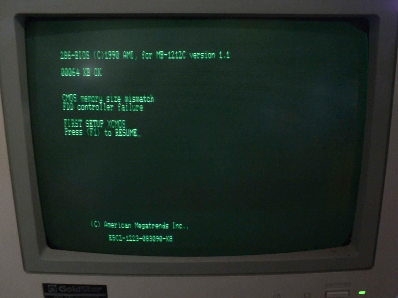 This is the basic look we are going for
To start, we can select a green color from the above image. To make it look bright and glowing, we will use a slightly lighter color than what we are going for.
When using colors in CSS, it's convenient to use the 'hsl' model because it means we can easily tweak the hue, saturation, and lightness of the color separately, so we can easily make different shades of the same color without complex math. For the body Let's try color: hsl(154 84% 70%);, then make a darker, less saturated shade of that green for the background, background: hsl(154 50% 5%);.
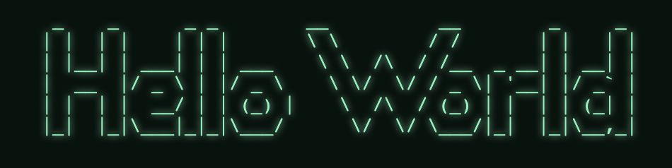
Now to give it the characteristic fuzzy glow of green phosphor, we can add text-shadow with 0 x and y offsets, a 5px blur-radius, and the same color we use for text. You can tweak the intensity of the glow by using more lightness or changing the blur radius.
text-shadow: 0 0 5px hsl(154, 84%, 70%);
Here's what we have so far. Not bad!
<style>
  body {
    background: hsl(154 50% 5%);
    color: hsl(154 84% 70%);
    text-shadow: 0 0 5px hsl(154 84% 70%);
  }
</style>

<body>
<pre>
  _    _      _ _        __          __        _     _
 | |  | |    | | |       \ \        / /       | |   | |
 | |__| | ___| | | ___    \ \  /\  / /__  _ __| | __| |
 |  __  |/ _ \ | |/ _ \    \ \/  \/ / _ \| '__| |/ _` |
 | |  | |  __/ | | (_) |    \  /\  / (_) | |  | | (_| |
 |_|  |_|\___|_|_|\___/      \/  \/ \___/|_|  |_|\__,_|
</pre>
</body>
Curve and Glare
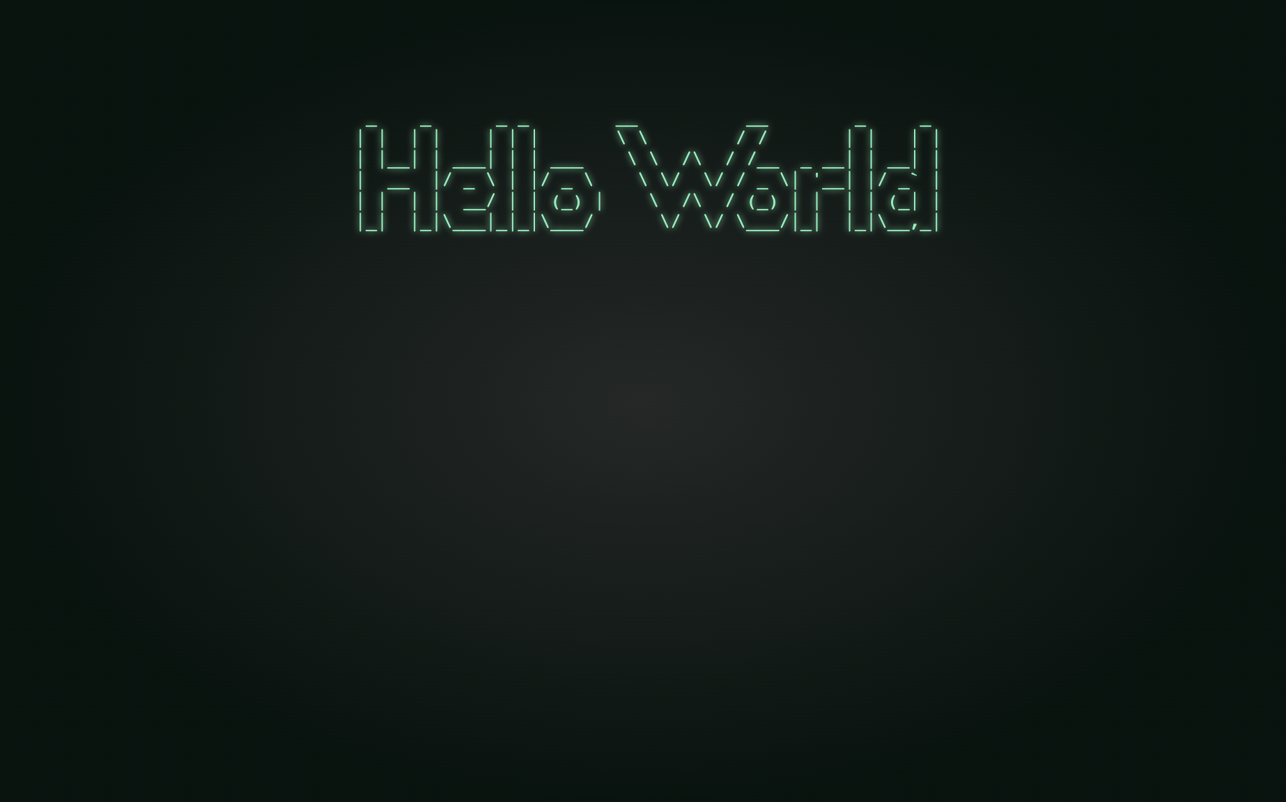
Next, we can give our background the illusion of a curvalicious CRT monitor with a bit of glare by using a radial gradient in the middle. For this, we'll create a position: fixed div that takes up the entire viewport by setting top, right, bottom, and left all to zero.
For the radial gradient, you can use a lighter, less saturated version of the color in the middle at 0%, and end with our dark green background color a little ways from the edge around 70%.
background-image: radial-gradient(hsl(154 5% 15%) 0%, hsl(154 50% 5%) 70%);
Finally, ensure you use z-index: -1; so that the body text appears above this effect.
/* The curvy screen glare effect */
  #glare {
    position: fixed;
    top: 0;
    left: 0;
    right: 0;
    bottom: 0;
    z-index: -1; /* ensure the effect doesn't cover the text */
    background: radial-gradient(hsl(154 5% 15%) 0%, hsl(154 50% 5%) 70%);
  }
Low-Resolution Effect
Next we try to simulate the low-resolution look of an old, interlaced monitor (interlacing is where the cathode ray draws every other line with each pass). We create another full-screen div as with the glare effect, except this time it must be above the text, so it gets a z-index of 1. To ensure that this doesn't interfere with clicking other elements on the screen, we also add pointer-events: none;.
We add repeating-linear-gradient that is transparent for two pixels, then a translucent black for the next two pixels, like so:
background: repeating-linear-gradient(transparent 0px 1px, hsl(154 0% 0%/.35) 3px 4px);
Flicker Effect
To add a flickery interlacing effect that looks all kinds of glitchy (or possibly seizure inducing when taken to an extreme), use CSS animation to move the background 2 pixels up and down rapidly. Repeat this every 1/30 of a second to emulate a typical CRT at '60i' (60 Hz interlaced). (Modern LCDs usually update at 60Hz, so this should update twice with every real refresh).
Depending on the exact colors you use, the effect may not be very noticeable. This may also look quite different depending on the resolution and refresh rate of the display you are viewing. You can tweak the effect by decreasing the opacity of the dark (non-transparent) color in the repeating-linear-gradient or, alternatively, try using a 1/15s cycle (0.66666666s). (This will look very flickery and not be conducive to long-form reading.)
/* low-resolution screen overlay interlacing */
@keyframes lines {
  0% {background-position: 0px 0px}
  50% {background-position: 0px 0px}
  51% {background-position: 0px 2px}
  100% {background-position: 0px 2px}
}

#interlaced {
  position: fixed;
  background: repeating-linear-gradient(transparent 0px 1px, hsl(154 0% 0%/.3) 3px 4px);
  top: 0;
  left: 0;
  right: 0;
  bottom: 0;
  z-index: 1;
  pointer-events: none;
  animation: lines 0.066666666s linear infinite;
}
Blinking Command Prompt
For the last retro computer detail this tutorial covers, we can create a command prompt using > and an underscore. We'll create one more @keyframes for a blink effect and apply it to the cursor, repeating infinitely every 0.4s.
  @keyframes blink {
    0% {opacity: 0}
    30% {opacity: 1}
    70% {opacity: 1}
    100% {opacity: 0}
  }

  .blink {
    animation: blink 0.4s linear infinite;
  }
The Finished Product
Check out the following CodePen to see what this demo looks like so far:
<html>
<head>
<style>
body {
background: hsl(154 50% 5%);
color: hsl(154 84% 70%);
text-shadow: 0 0 4px hsl(154 84% 70%);
font-family: monospace;
font-size: 16px;
}
pre {
margin: auto;
margin-top: 10vh;
display: table;
}
#glare {
position: fixed;
top: 0;
left: 0;
right: 0;
bottom: 0;
z-index: -1; /* ensure the effect doesn't cover the text */
background: radial-gradient(hsl(154 5% 15%) 0%, hsl(154 50% 5%) 70%);
}
@keyframes lines {
0% {background-position: 0px 0px}
50% {background-position: 0px 0px}
51% {background-position: 0px 2px}
100% {background-position: 0px 2px}
}
#interlaced {
position: fixed;
background: repeating-linear-gradient(transparent 0px 1px, hsl(154 0% 0%/.3) 3px 4px);
top: 0;
left: 0;
right: 0;
bottom: 0;
z-index: 10;
pointer-events: none;
animation: lines 0.066666666s linear infinite;
}
@keyframes blink {
0% {opacity: 0}
30% {opacity: 1}
70% {opacity: 1}
100% {opacity: 0}
}
.blink {
animation: blink 0.4s linear infinite;
}
</style>
</head>
<body>
<pre>
_ _ _ _ __ __ _ _
| | | | | | | \ \ / / | | | |
| |__| | ___| | | ___ \ \ /\ / /__ _ __| | __| |
| __ |/ _ \ | |/ _ \ \ \/ \/ / _ \| '__| |/ _` |
| | | | __/ | | (_) | \ /\ / (_) | | | | (_| |
|_| |_|\___|_|_|\___/ \/ \/ \___/|_| |_|\__,_|
<p>Would you like to play a game?</p>
<p>><span class="blink">_</span></p>
</pre>
<div id="interlaced"></div>
<div id="glare"></div>
</body>
</html>
That covers this tutorial of the retro computer screen effect using CSS.
In the Part 2 of this series, we cover using JavaScript to
- create an effect that slowly draws text onto the screen
- making a simulated command-prompt that accepts text input
- responding to command input
If you had fun with this demo, and want more content like this, you can follow me on Twitter at @jdlien.
About the author
I have been developing websites professionally since 1999 and have used a number of technologies and watched the evolution of the web since its early days.
I write about PHP, Laravel, Tailwind, and topics about improving your career as a developer.
Comments
Join the discussionWaiting for part2 for the command prompt! Love it
That looks so cool! I'll bookmark it for future use :)


