
You could build your website to be easy for users to use. But why go through the effort of building an attractive UI that makes it easy for users to do what they want?
Instead, you just try these designs to trick users into giving you what you want!
Think of the benefits:
- Increase sales by having users purchase things they didn't even know they were buying!
- Get loads of email addresses so you can directly market to people who stumbled upon your website by accident once.
- Monetize content by tricking kids into filling out surveys for dubious rewards. (HEY KIDS! FREE ROBUX!)
- Make your users feel bad if they don't accept your awesome offers.
- Increase engagement by giving users no other choice.
For the history of the Web, unscrupulous website owners have been designing sites to trick users into making purchases, hand over personal information, or view more ads. Obviously no user enjoys these experiences, but unfortunately these techniques do work — at least in the short-term.
The term 'dark pattern' was coined by Harry Brignull in 2010, who maintains a website that keeps track of many of the worst offenders that use these types of designs.
Here are several examples of common deceptive designs.
Sneak Into Basket
Sometimes when you go to check out your shopping cart, an item you didn't actually want was there. Sometimes this seems good-intentioned, such as a small charity donation, but oftentimes this is used to add "extended warranties" or purchase protection. Many software stores used to sell you a "backup download" or some nonsense, pre-checking the option for an additional few dollars when you purchased downloadable software.
Roach Motel
It's easy to get in, but good luck leaving!
Example: To create an account on Amazon, there's a very obvious "New Customer? Start here." link that takes you to a simple signup page that basically just requires your name, email, and a password. Easy peasy!
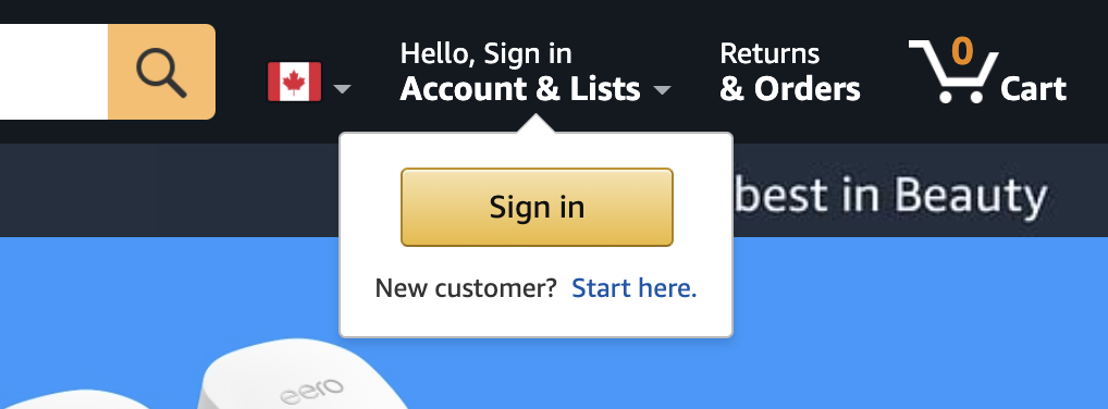
But what if you want to delete your account?
Amazon makes users scour the website and such a link is not located anywhere. Ultimately, you have to go three pages deep into a place where you can initiate a chat with customer support, who then try to talk you out of deleting your account. Finally, they give you a link that can initiate the procedure to delete your account. The whole process likely would take 20 minutes even if you knew exactly what you were doing.
Similarly, in the 1990s, AOL used to mail out floppies and CDs that made it dead-simple to sign up for a "free" AOL account. But if you want to cancel your service? Get prepared to call in and wait on hold for around an hour where an agent will try to talk you out of it.
Confirmshaming
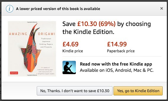
Ever seen one of those links that has a giant button to sign up for something (like a newsletter or credit card) and then somewhere weird there's a tiny little link that says something like "No, I'm stupid and don't want to save money"? This pattern is called confirmshaming. It's a great way to make potential customers feel like the website-owner is a real dick.
Misdirection
Have you ever installed software on your computer that had a pre-checked checkbox saying "✅ Install FREE AdWare and Browser Toolbars"?
A lot of free (and even paid) software products make a good bit of their revenue by bundling in crap you don't want on your computer using this sort of technique. Less savvy users would be hesitant to change the default installer settings and would end up with some dreck on their PCs that clutters up their system, or worse, installs some sort of malware.
Often the same sites where this sort of software can be downloaded will have a wall of download buttons, and if you're lucky, maybe one of them will actually be the legitimate download link for the item you want. The rest download something you almost certainly don't want!
Another form of misdirection is when websites change the order of controls buttons on their website to mess with user's muscle memory. Take this form that most users would normally just go through and click "No" to every option on.
It might be quite easy to find yourself accidentally signed up for an email list. Or worse!
Fake Notifications
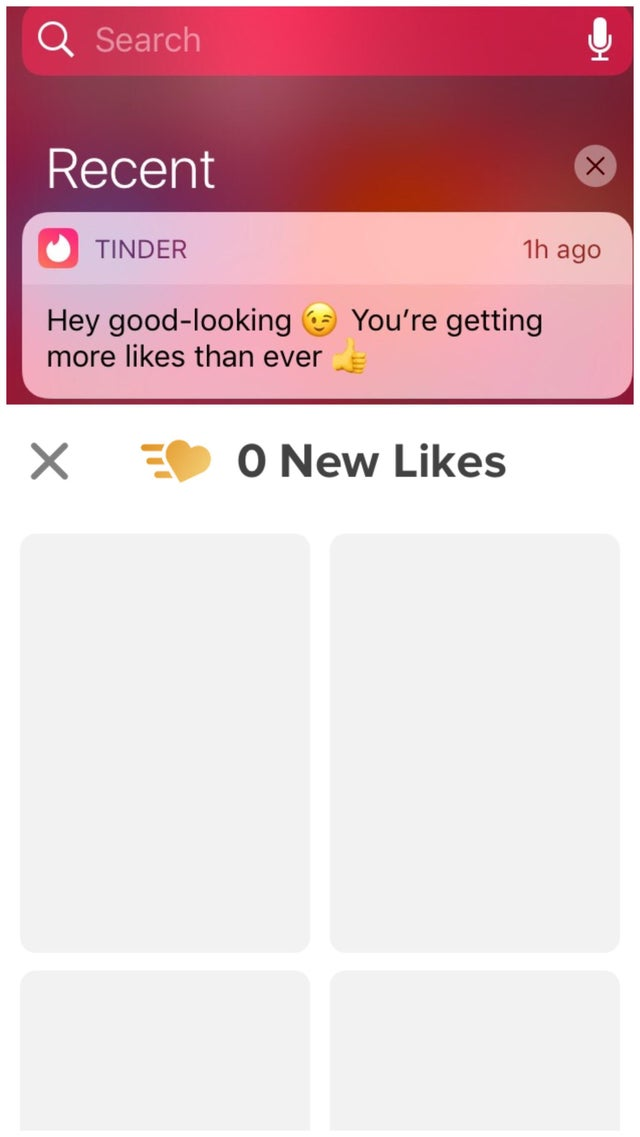
Websites sometimes stick a red dot on something, or even use motion or banners alerting you that there's a notification. When you finally read it, you essentially end up finding a nuisance ad.
Here's a misleading notification from Tinder that is essentially just an ad tricking users into opening up the app and attempting to boost engagement.
Privacy Zuckering
Detailed personal information about you is worth a lot to advertisers. Some websites are designed to coerce users into sharing more information about themselves than is really necessary. This is often achieved is by websites being unclear about what information they share or making it difficult to control privacy settings.
Guess who this pattern is named after?
Disguised Ads
Sometimes ads are designed to look like a legitimate part of application UI. Or even sneakier, ads will add a hair or bit of dust so that users attempt to brush it off their phone screen, accidentally triggering a click on the ad.

Bait and Switch
You think you're doing one thing, but something else happens. This application makes you think you're just getting a free download when in reality, you're signing up for a subscription to something you probably don't want.

Forced Continuity
Often services will sign you up for a "free" service, only to start charging you after you've forgotten what you've done. Even worse, there are a category of scammy iPhone apps that bill you weekly so the price is more than 4x more expensive than you might have expected if you didn't read carefully.

Should You Actually Use These Patterns?
No.
As a web developer, you may be asked to implement stuff like these designs above. While they may work in the short-term to get some clicks, add subscribers, or increase sales a bit, using these sneaky tactics will only do your business reputational harm, and it will annoy users, perhaps alienating some of them.
I believe strongly that a business and a brand should be built on strong ethical principles of serving customers well and offering good quality products and helping customers get value from what you offer. Using these sorts of tricks almost exclusively do the opposite, and are not a long-term road to success.
Aside from that, there is legislation being proposed in the United States called the DETOUR Act (Deceptive Experiences To Online Users Reduction). Although this law seems pretty squarely targeted at big tech, it's possible that at some point in the future, using deceptive design could land a company in legal hot water.
If you enjoyed this article, or have anything to add, please add a comment or follow me on Twitter for more web development tips.
About the author
I have been developing websites professionally since 1999 and have used a number of technologies and watched the evolution of the web since its early days.
I write about PHP, Laravel, Tailwind, and topics about improving your career as a developer.
Comments
Join the discussionNo comments yet. Be the first to comment.


